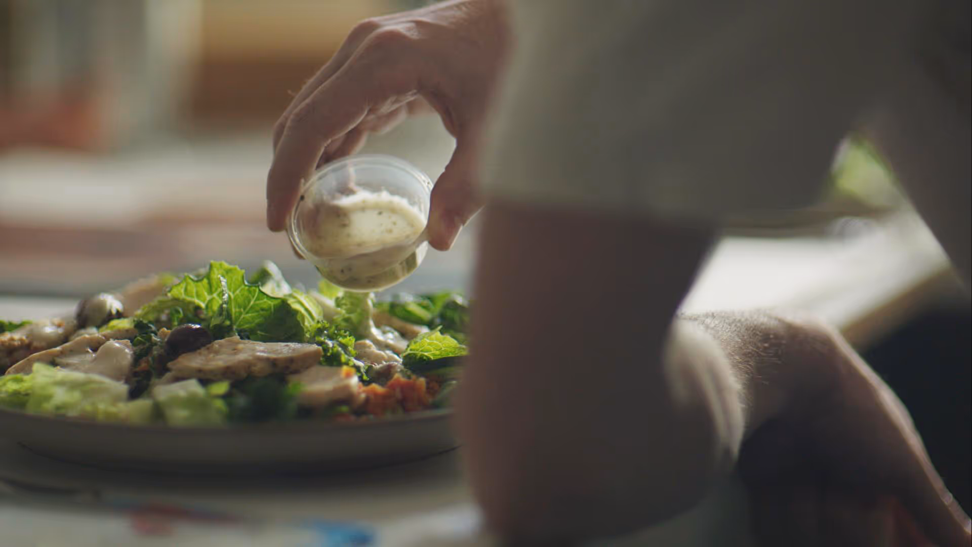
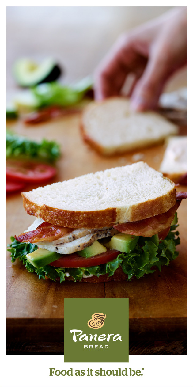
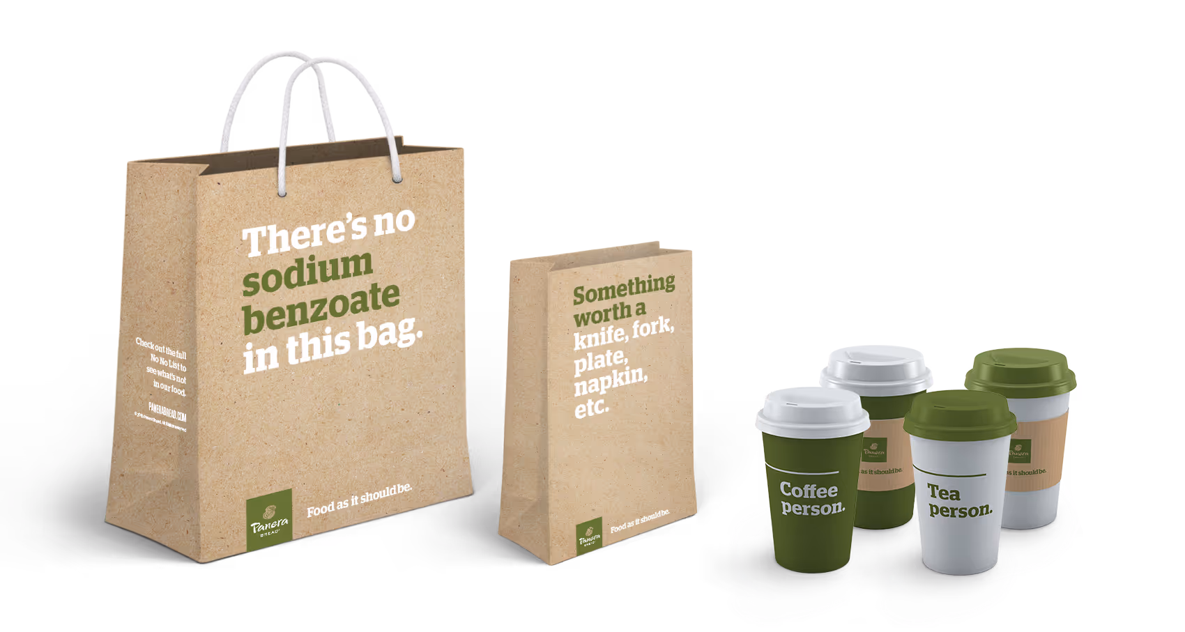
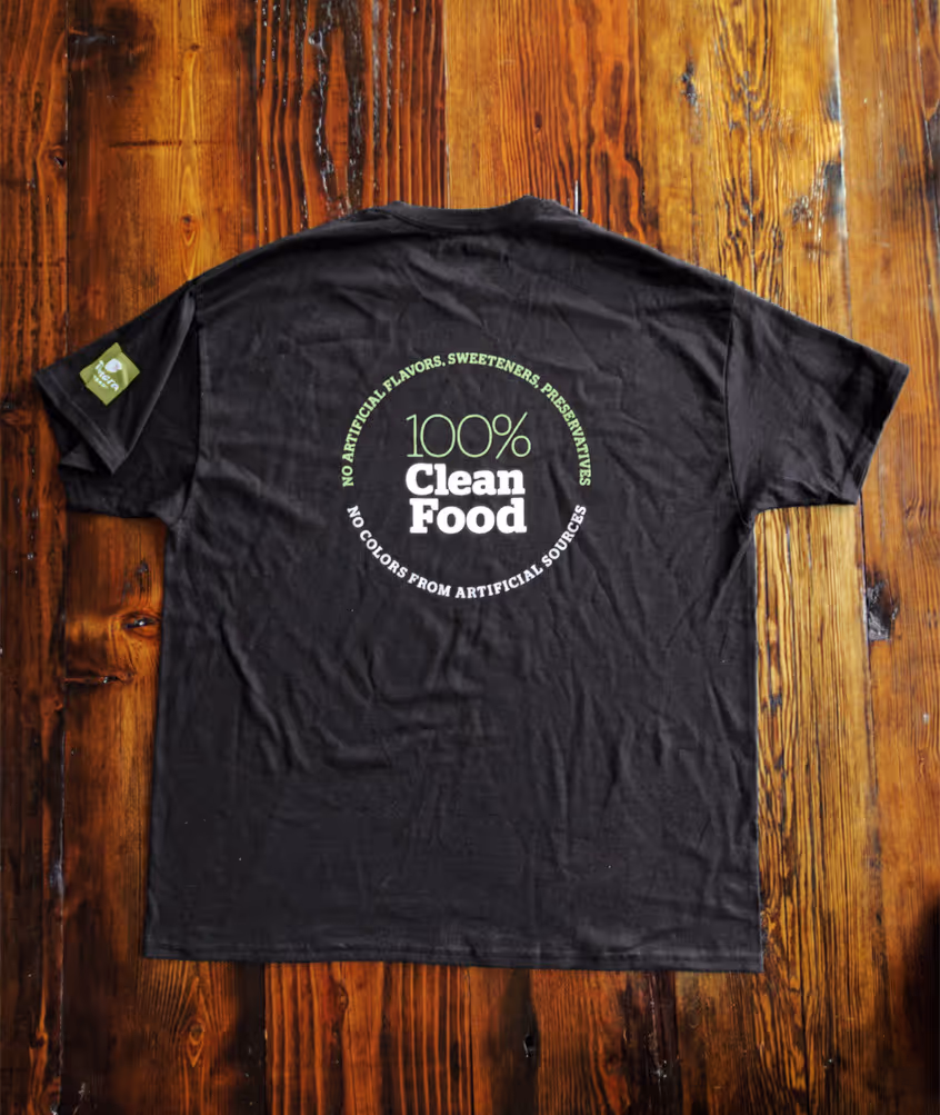
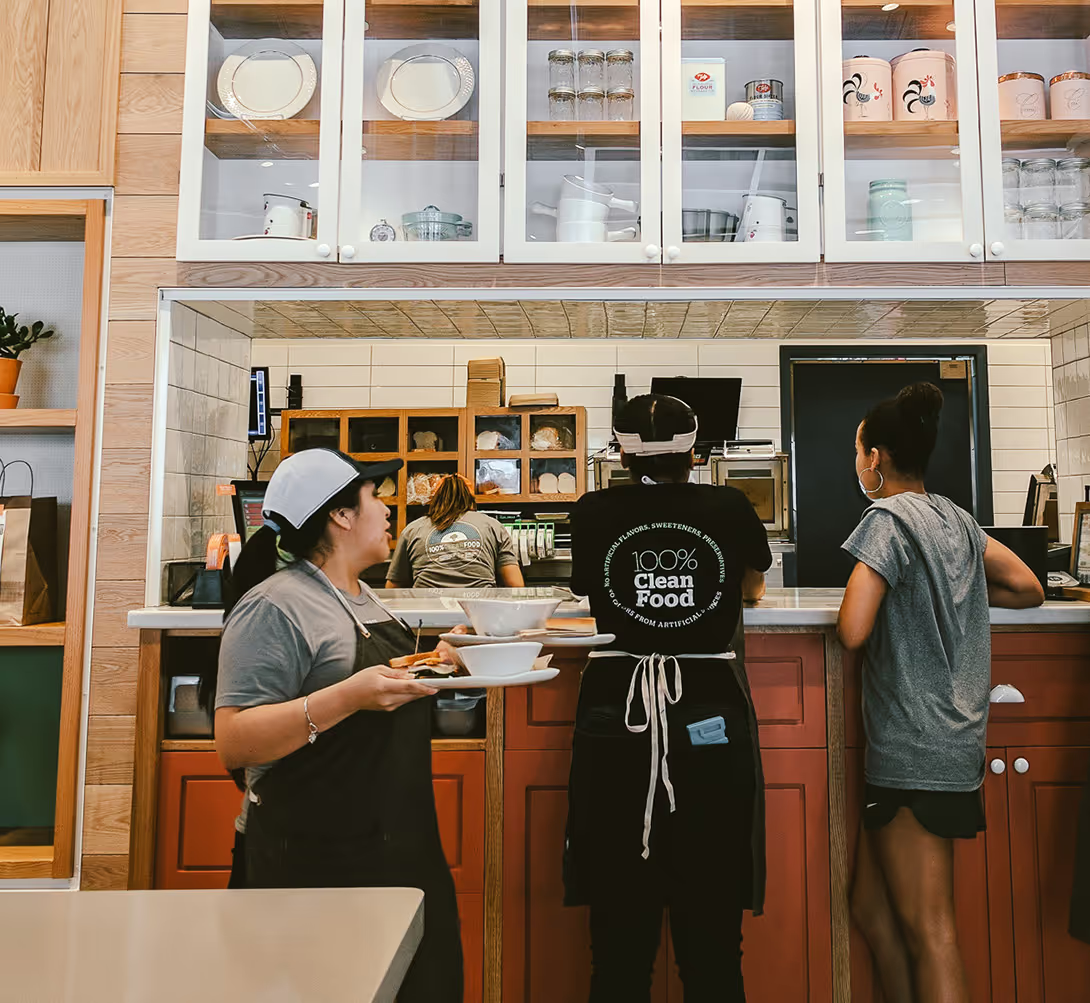
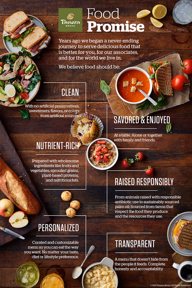
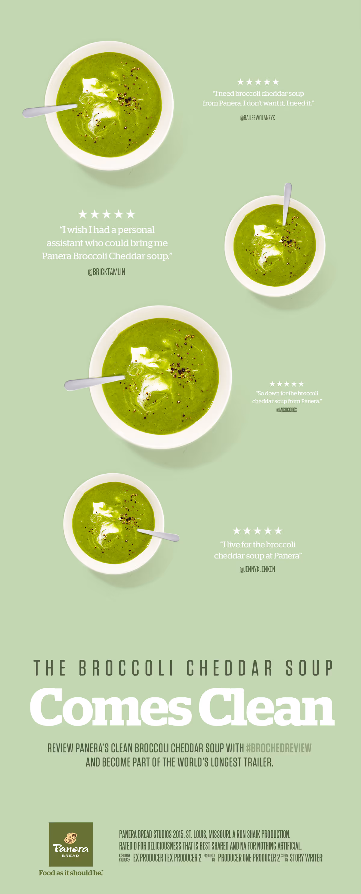
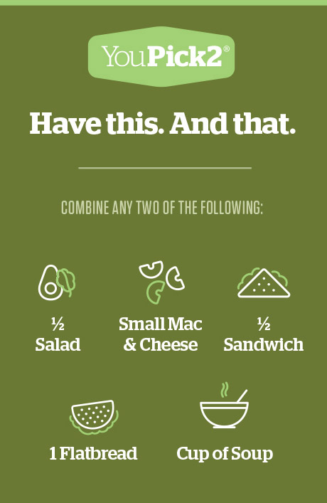
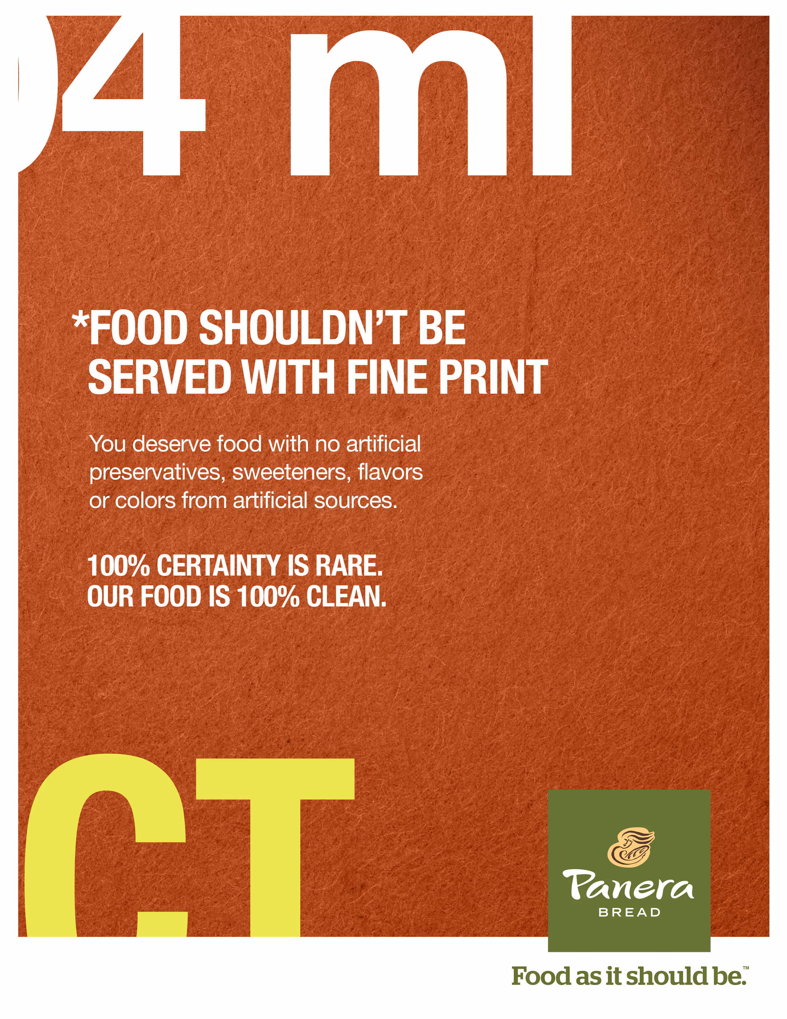
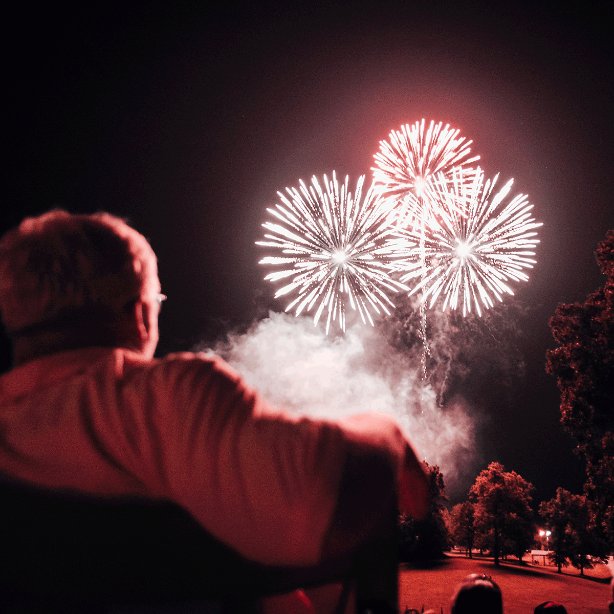
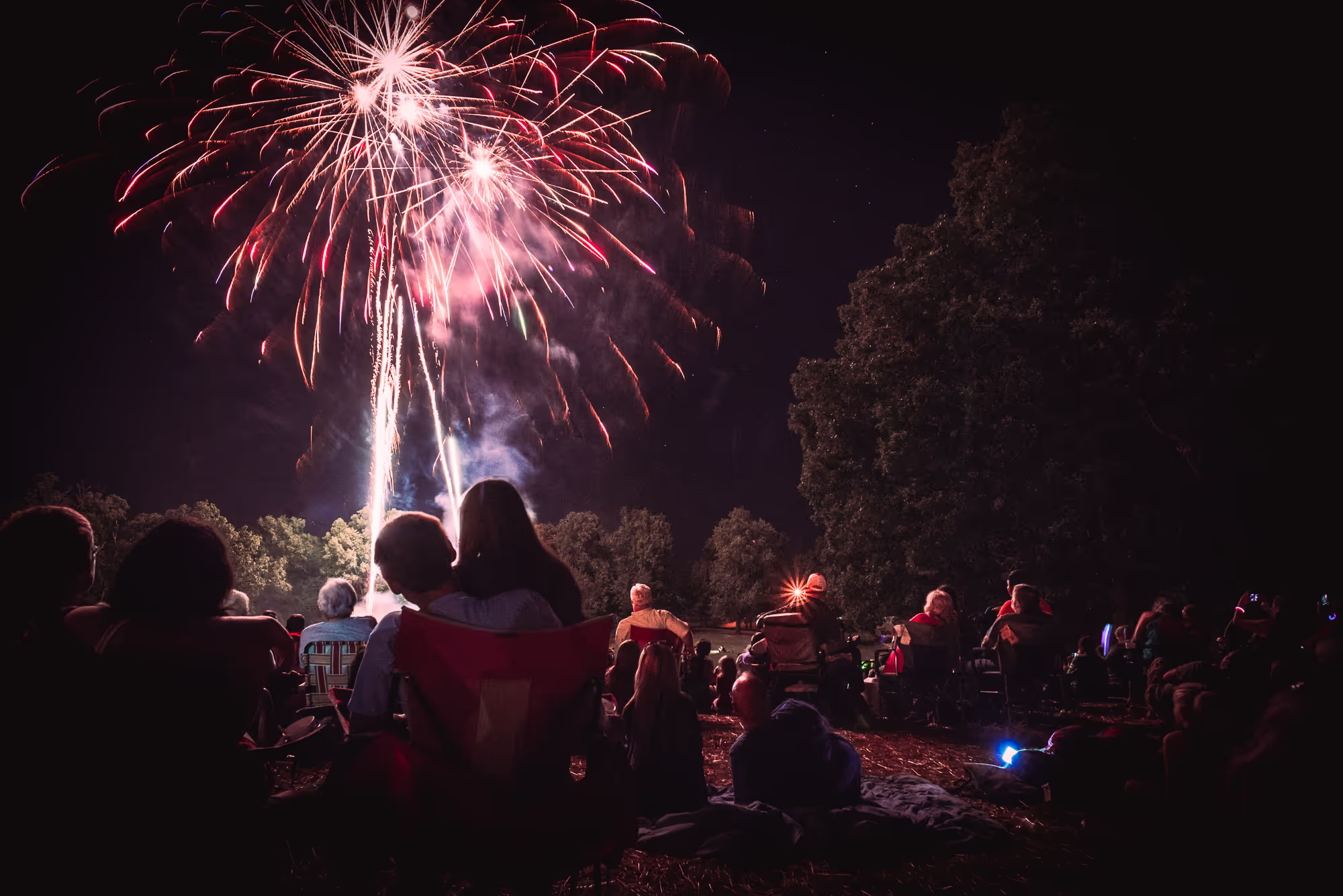
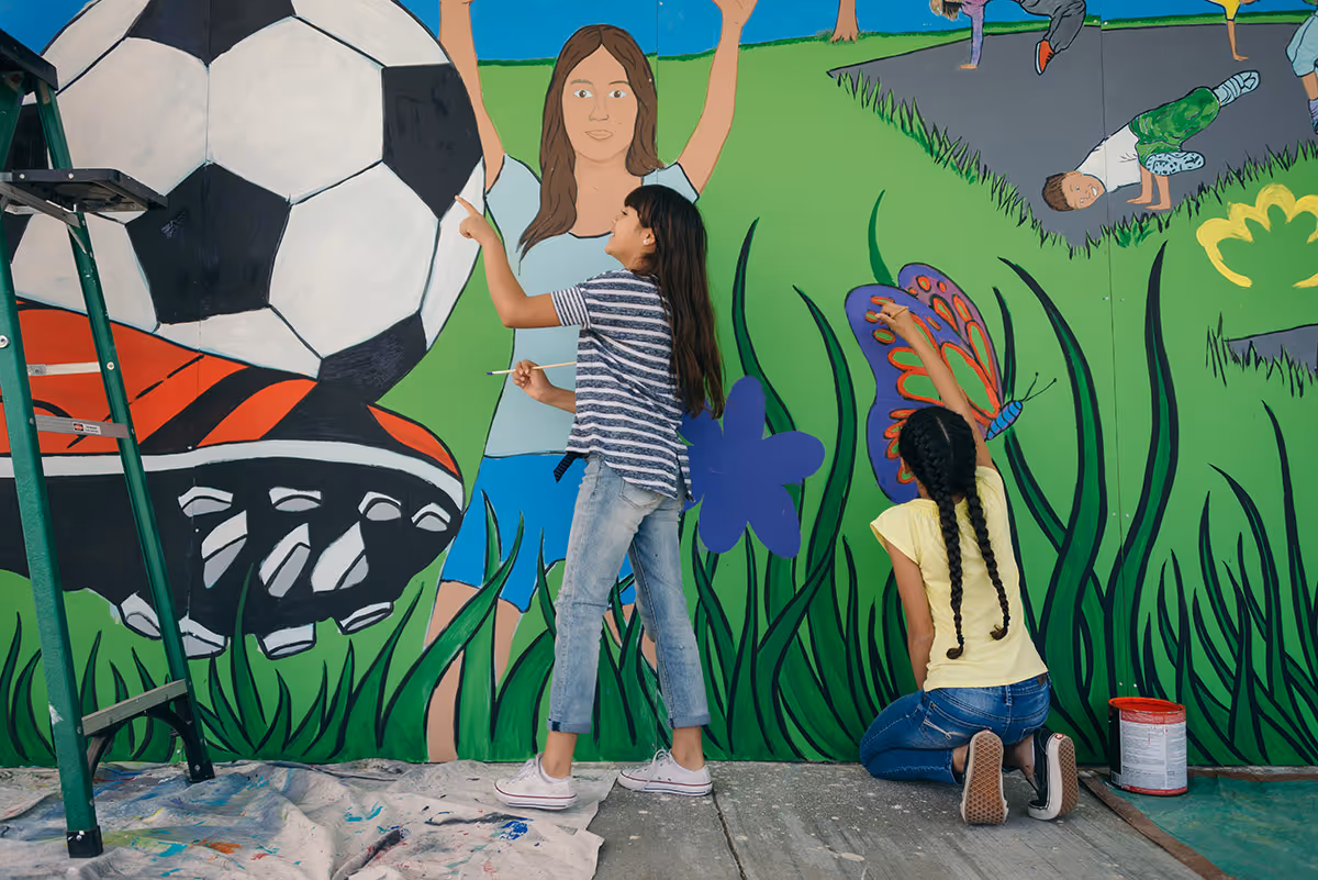
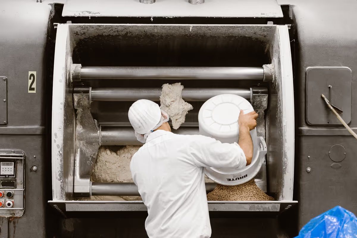
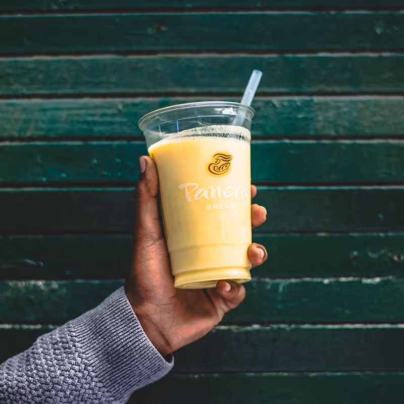
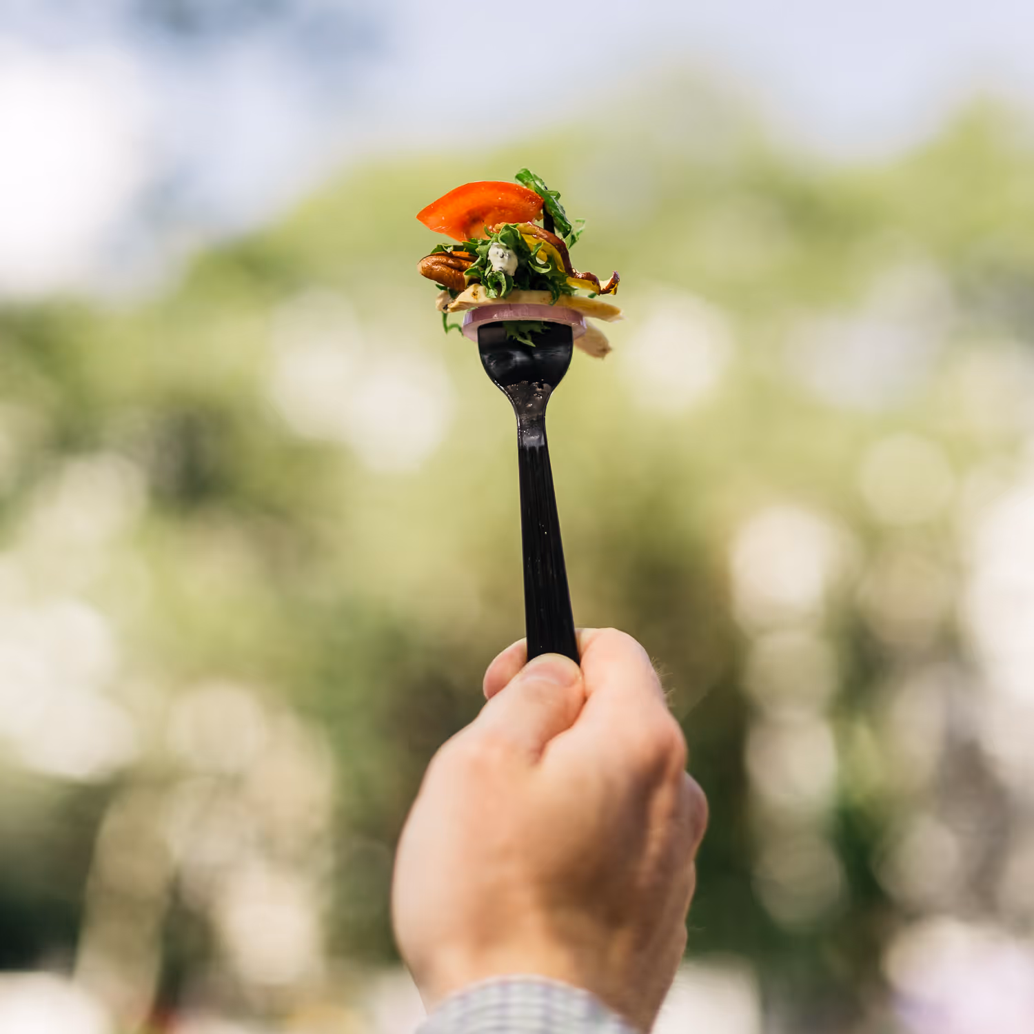
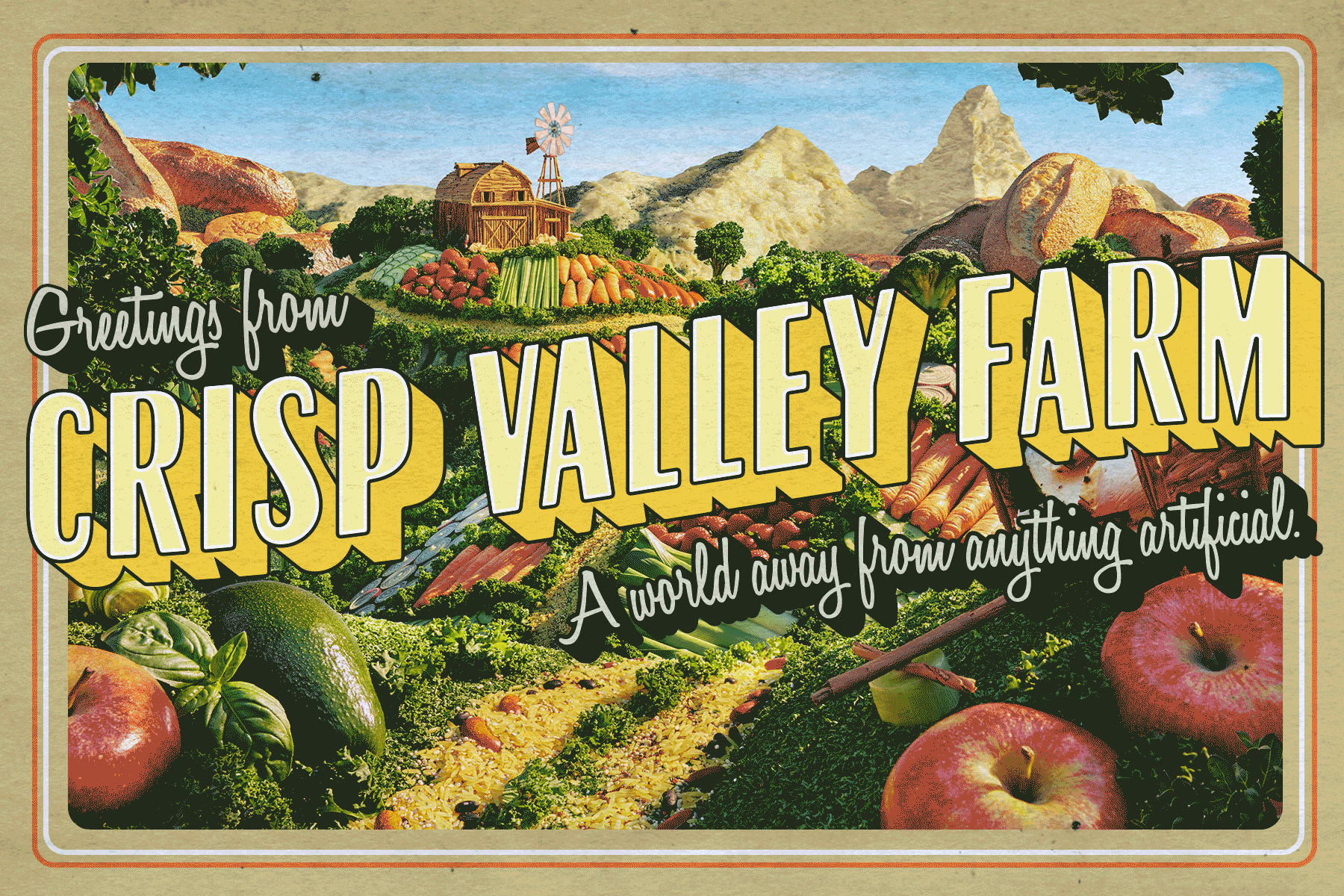
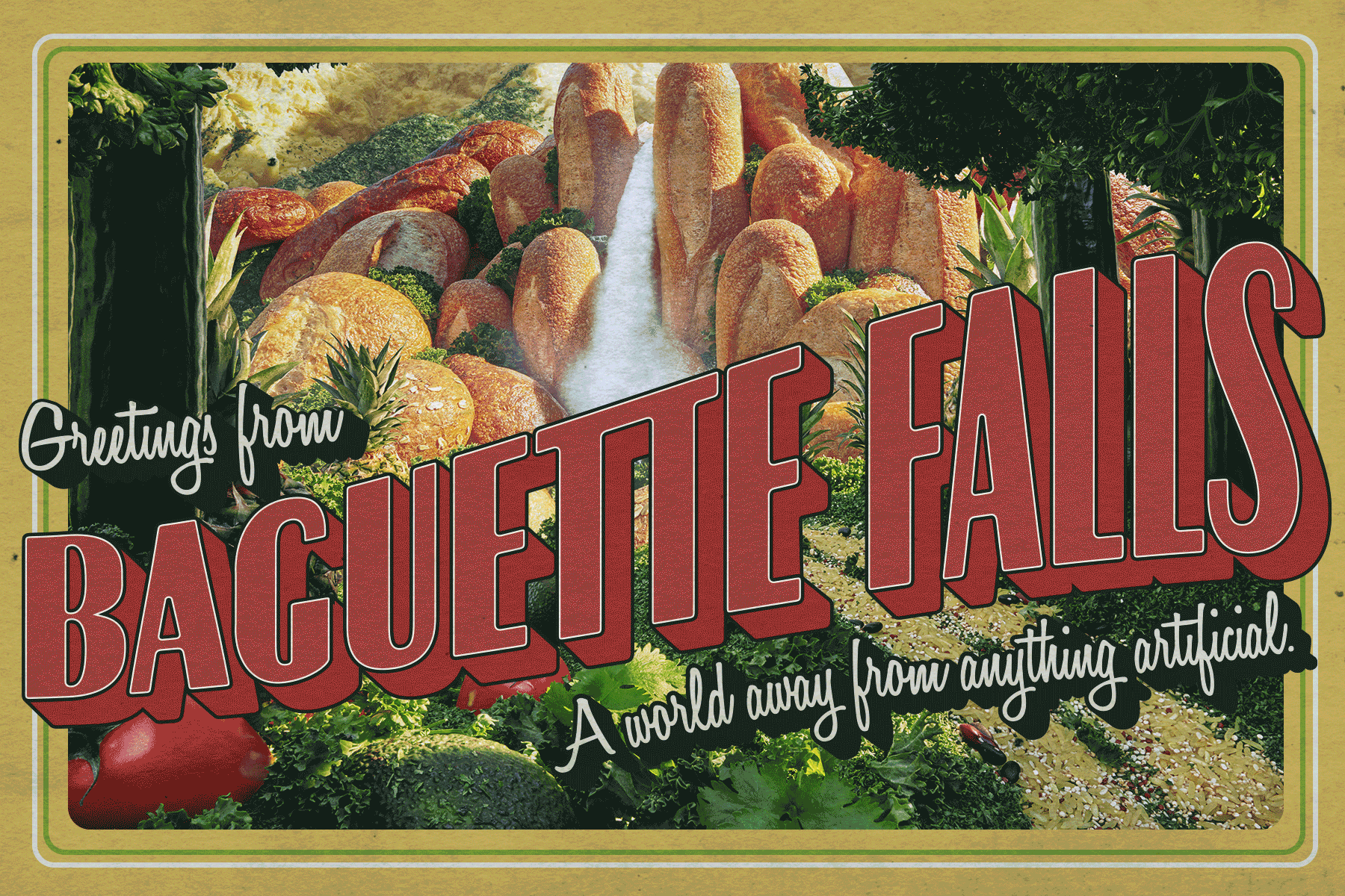
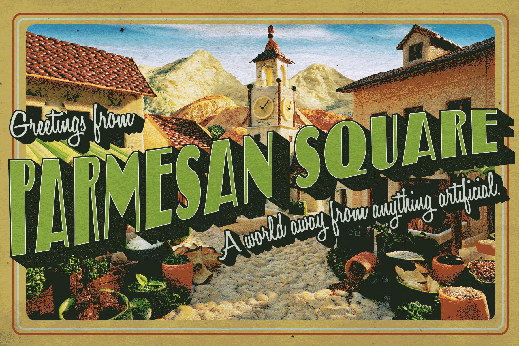
Panera Bread was in the midst of a major shift, moving toward “clean” food and clearer messaging, and I had the opportunity to help bring that transformation to life over the course of two years. We established new brand guidelines that introduced a fresh type system, a revitalized color palette (featuring lovely pastels), and an iconography system that simplified what is otherwise a very expansive menu. The work spanned across truck wraps, employee t-shirts, and complete grand opening experiences for new stores. From window clings to exterior signage, the goal was to create a consistent voice that felt approachable and warm. Photography played a major role, with imagery designed to feel “in the moment” and point of view. I also contributed directly by shooting content for Panera’s social feed, keeping small details aligned with the larger brand. The challenge of making such a complex brand feel simple was addressed through clear design choices: large, legible type, soft colors, and consistent iconography. The result was a refreshed identity that communicated Panera’s mantra, “Food as it should be,” in a way that felt accessible and memorable.