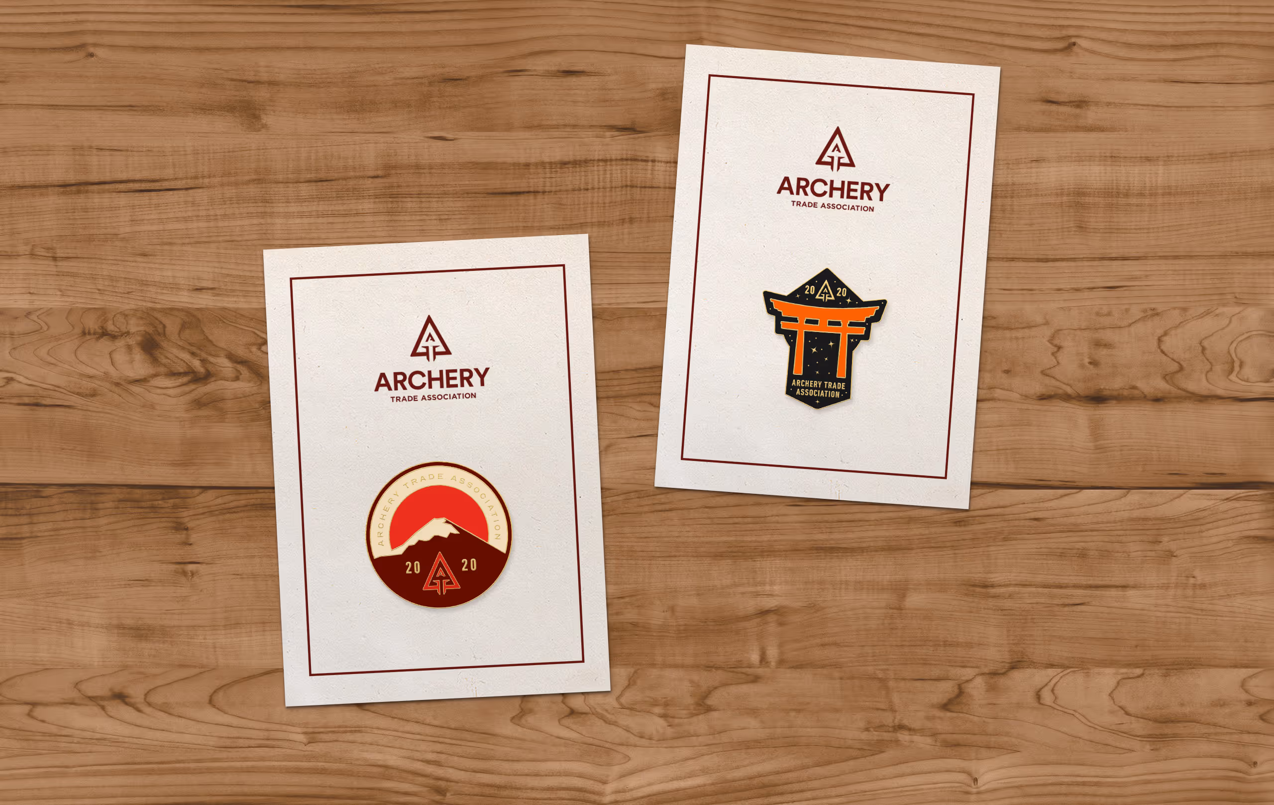
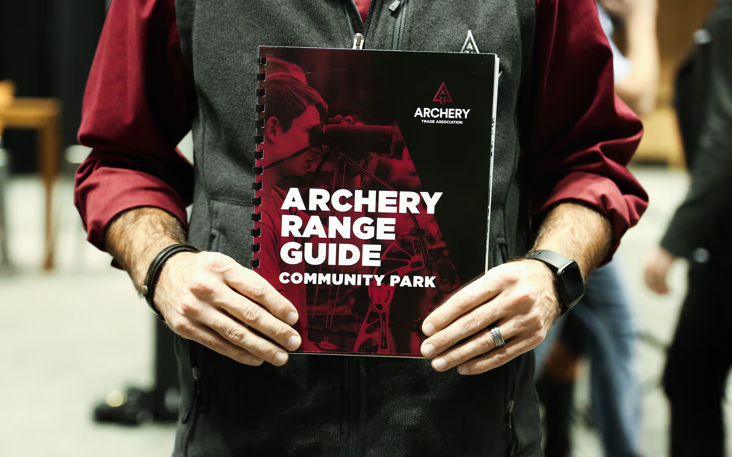
Archery Trade Association had a super fresh rebrand that needed to be fleshed out and translated across all their touchpoints. My role was to extend that system into a wide range of applications including trade show signage, wall graphics, printed mentorship guides, range materials, Olympic pins, merchandise, and digital assets for their member app. One of the central challenges was balancing ATA’s heritage-heavy audience of seasoned bowhunters with the need to welcome new and curious archers. That meant leaning into tradition and craft in some contexts, while dialing up accessibility and clarity in others. The result was a brand expression that stayed true to archery’s roots while giving the organization tools to engage future generations.