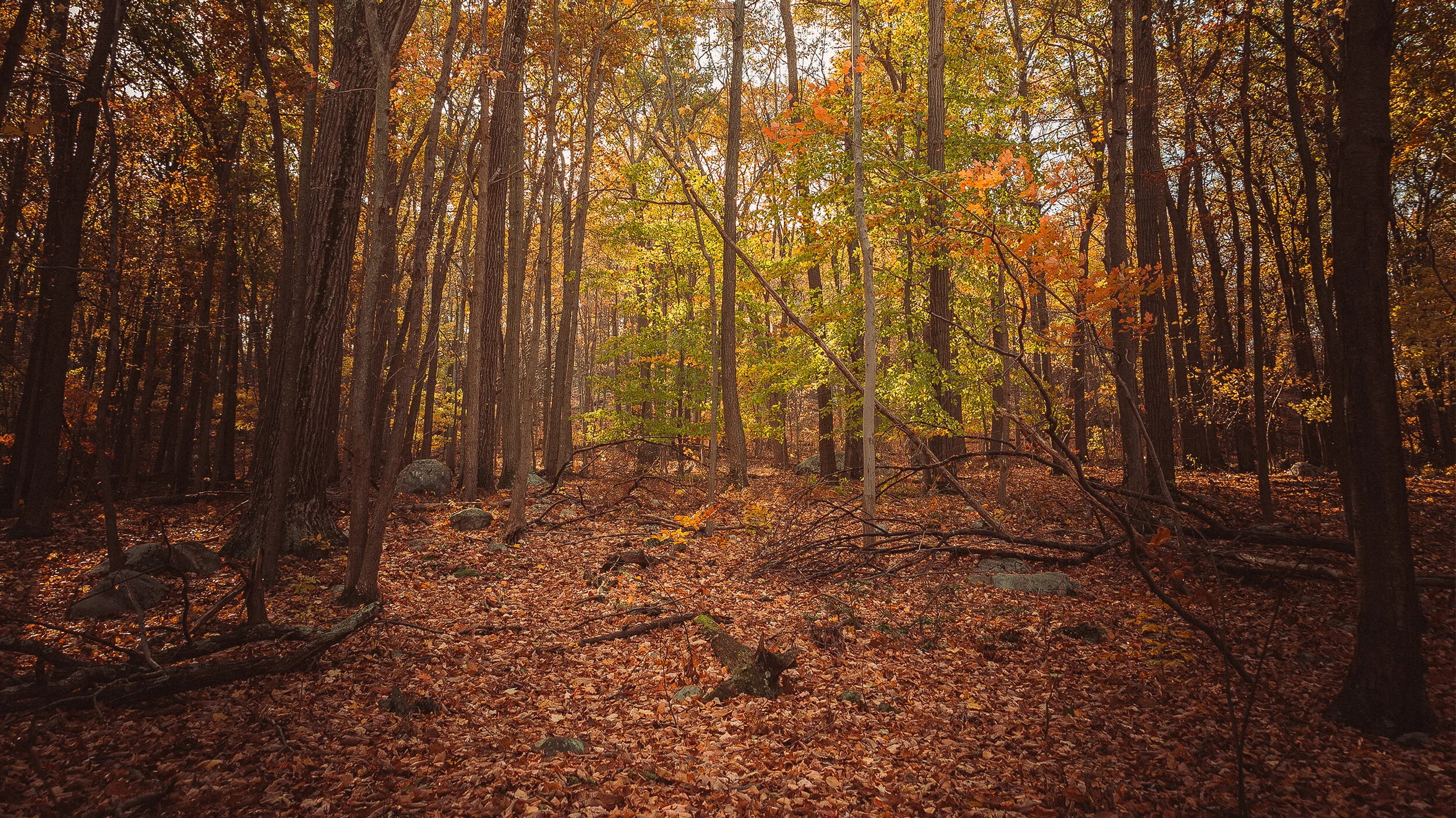
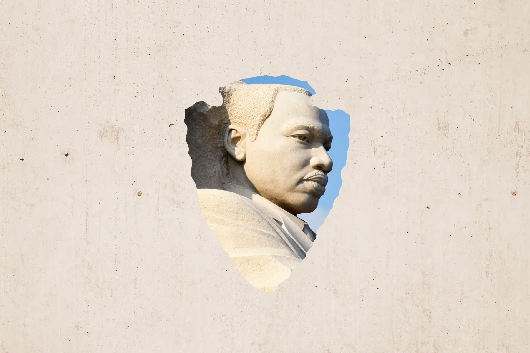
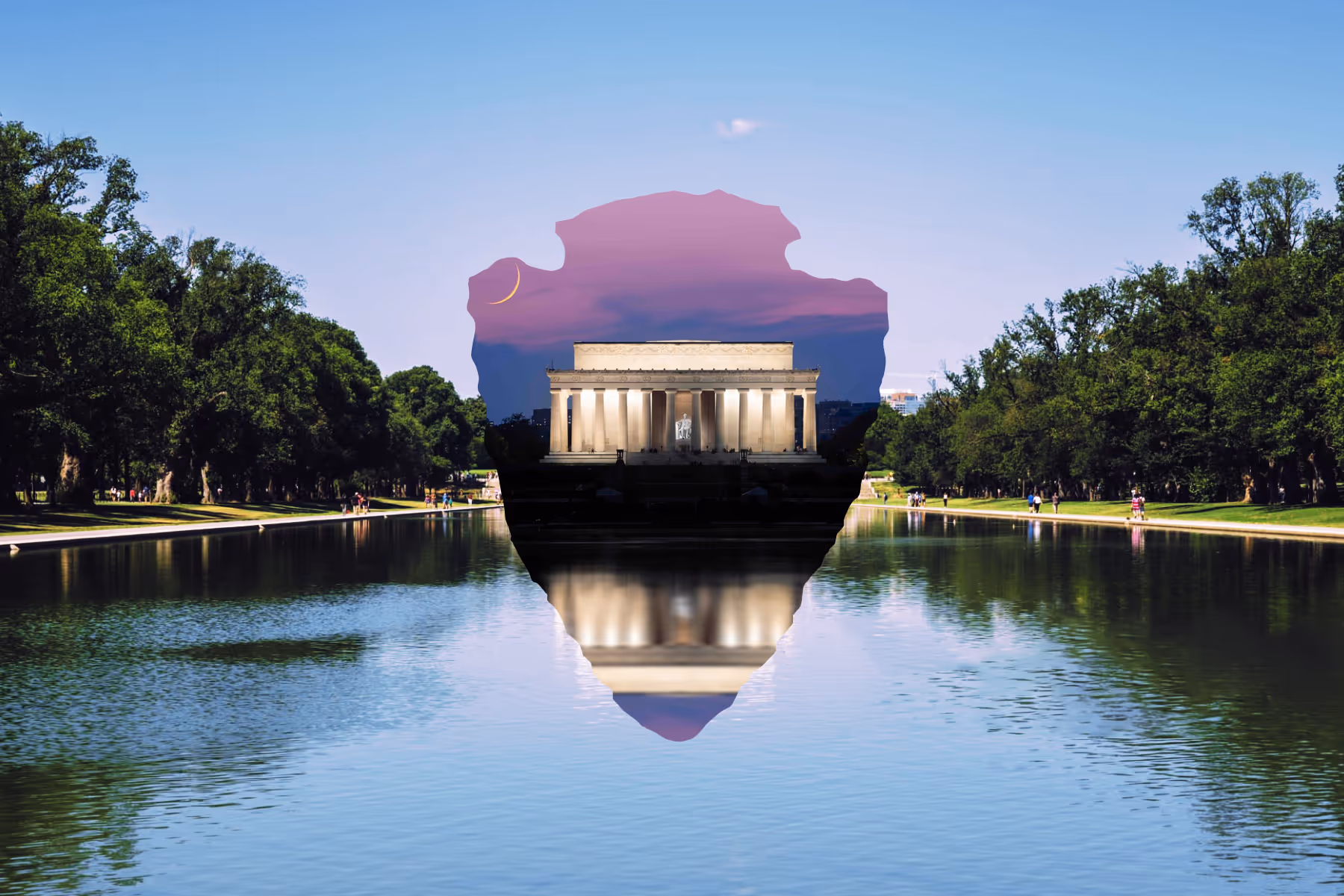
The National Park Service and National Park Foundation were looking to build a new brand and campaign for their centennial celebration. Upon reviewing their existing brand system, I realized the existing brands were a bit dissonant with lots of different colors, type, imagery, and so on. So instead of simply giving them a centennial logo (and adding to their visual confusion), they got a brand overhaul instead… as well as the originally requested Centennial logo. As a brand with a heritage, they felt the current logo wasn't inclusively representing the wide variety of parks across the states, as most parks don't have sequoias, bison, or mountains. To address that, I stripped it back a bit and created a fresh, expandable branding system. The texture used throughout the new system was taken from the etchings of the original logo, thus bringing a bit of the heritage along with it. The classic arrowhead shape was also carried over, and the type was pulled out of the arrowhead itself which allows the logo to be reduced much smaller while still maintaining legibility. Giving this brand overhaul to both the NPS and NPF brought the two separate entities into the modern era under a brand that works in a modern context while still giving a nod to its history.