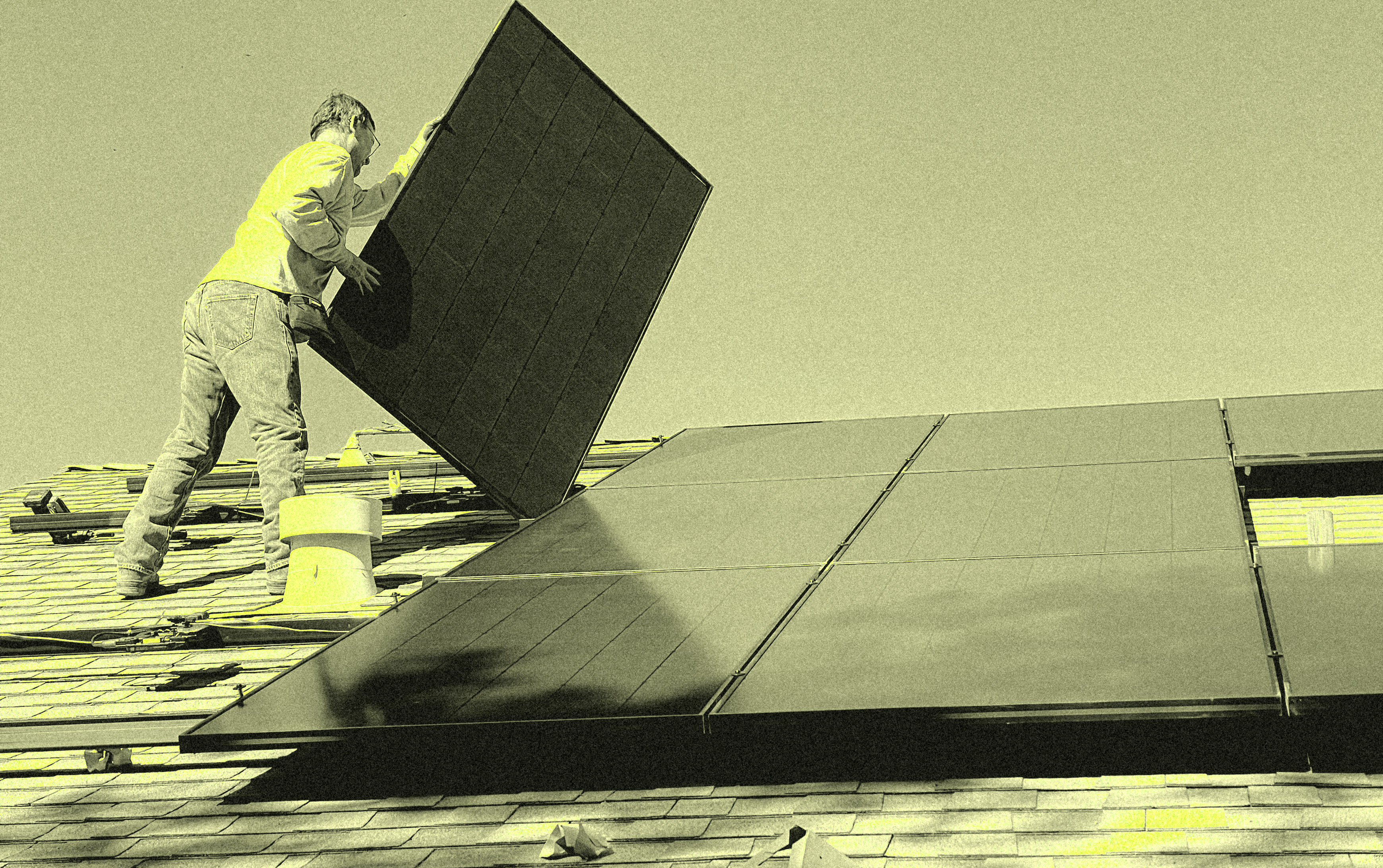
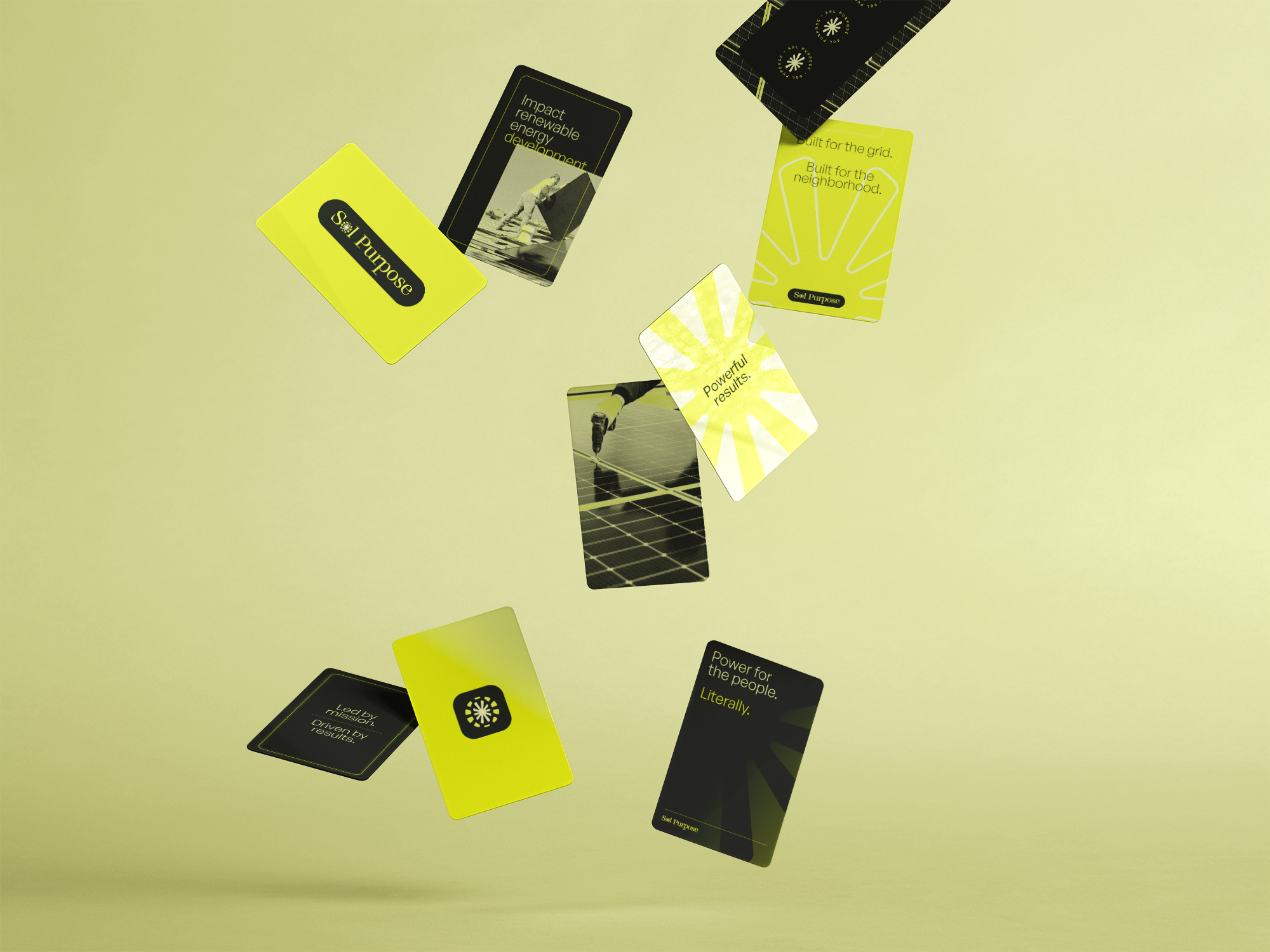
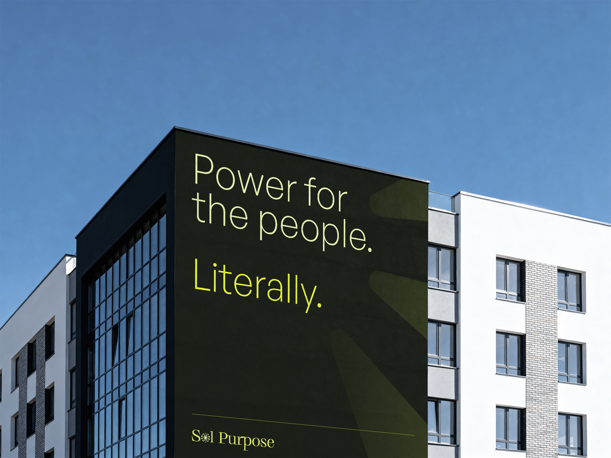
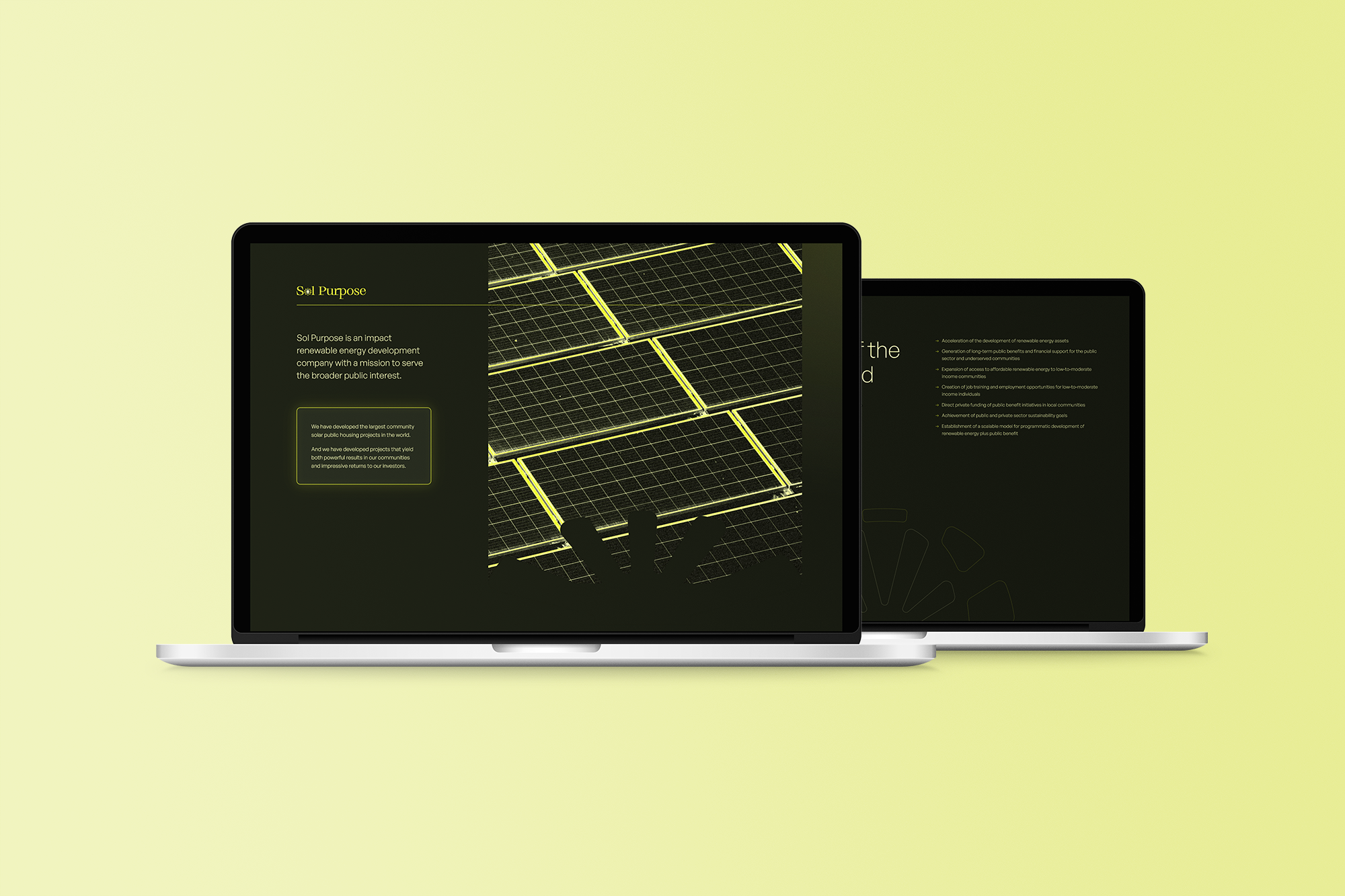
Sol Purpose operates at the intersection of renewable energy and genuine community impact — developing community solar projects for public housing and underserved communities at a scale nobody else has attempted. The rebrand needed to match that ambition without retreating into the safe, sanitized visual language that defines most of the clean energy space.The palette makes an immediate statement: a deep forest green anchors everything, with an electric acid yellow that cuts through it with real force. It's a combination that suggests both growth and voltage — organic and industrial at once. Where most impact-driven energy brands reach for sky blues and optimistic whites, this one feels more like a conviction than a tagline.The photo treatment pushes that further. Rather than defaulting to aspirational aerial photography, the imagery is processed into something almost graphic — high contrast, the geometry of the panels rendered in sharp relief against near-black. It gives the work a sense of scale and intensity that feels earned rather than performed.The logo ties it together: a classic serif wordmark with the "o" in Sol replaced by a radiating sun mark that reads as both celestial and industrial. It's subtle enough to feel refined, distinctive enough to stick. For an organization doing work this serious, the identity finally looks the part.